ios 安全区域适配和调试
创建ios webview 调试应用
- 第一步在xcode创建一个新的项目
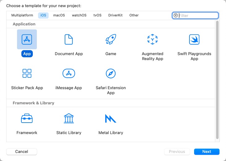
- 创建一个无导航栏的webview app
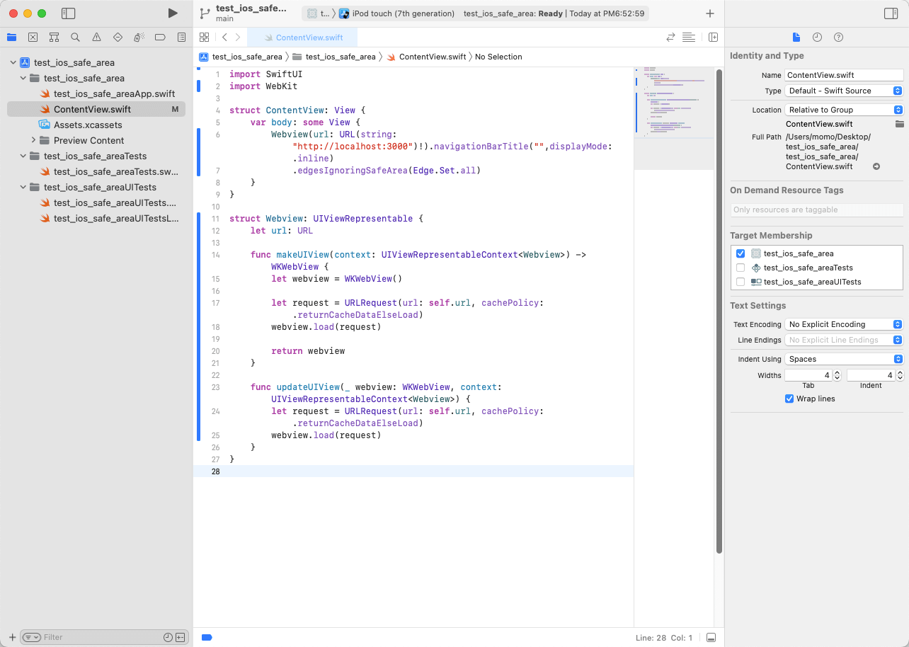
修改 ContentView.swift 文件, 将下面的代码替换 ContentView.swift 文件中的代码
import SwiftUI
import WebKit

struct ContentView: View {
    var body: some View {
        Webview(url: URL(string: "http://localhost:3000")!).navigationBarTitle("",displayMode: .inline)
            .edgesIgnoringSafeArea(Edge.Set.all)
    }
}

struct Webview: UIViewRepresentable {
    let url: URL

    func makeUIView(context: UIViewRepresentableContext<Webview>) -> WKWebView {
        let webview = WKWebView()

        let request = URLRequest(url: self.url, cachePolicy: .returnCacheDataElseLoad)
        webview.load(request)

        return webview
    }

    func updateUIView(_ webview: WKWebView, context: UIViewRepresentableContext<Webview>) {
        let request = URLRequest(url: self.url, cachePolicy: .returnCacheDataElseLoad)
        webview.load(request)
    }
}
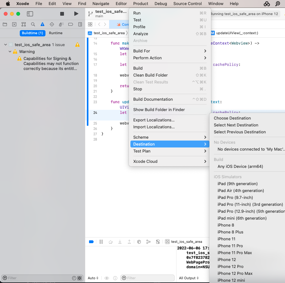
- 选择一个合适的机型, 然后运行
进行ios安全区域适配的知识准备
meta content 中的 viewport-fit
视口(viewport)代表当前可见的计算机图形区域
布局视口(layout viewport):布局视口是网页布局的基准窗口,在PC浏览器上,布局视口就等于当前浏览器的窗口大小, 在移动端,布局视口被赋予一个默认值,大部分为980px
视觉视口(visual viewport):用户通过屏幕真实看到的区域。
viewport-fit 可以设置视觉视口的大小。有三个属性值:
-
auto 默认行为,不影响初始化布局视口大小
- contain 初始化布局视口和视觉视口设置成内接在设备显示器中的最大矩形
- 布局视口&视觉视口按比例缩放,以适合显示内嵌的最大矩形
- cover 初始布局视口和视觉视口设置为设备物理屏幕的外接矩形。
- 布局视口&视觉视口被缩放以填充设备显示
| contain | 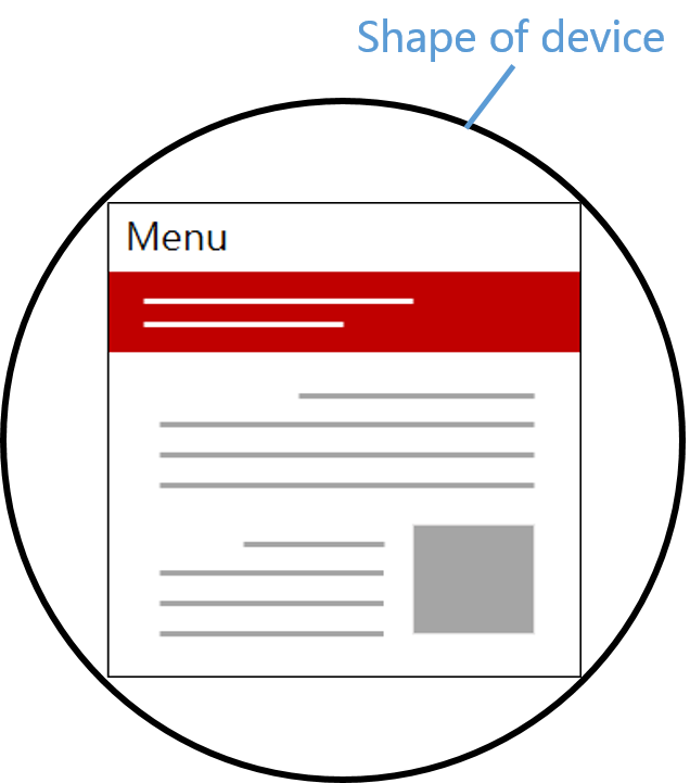 |
 |
| cover | 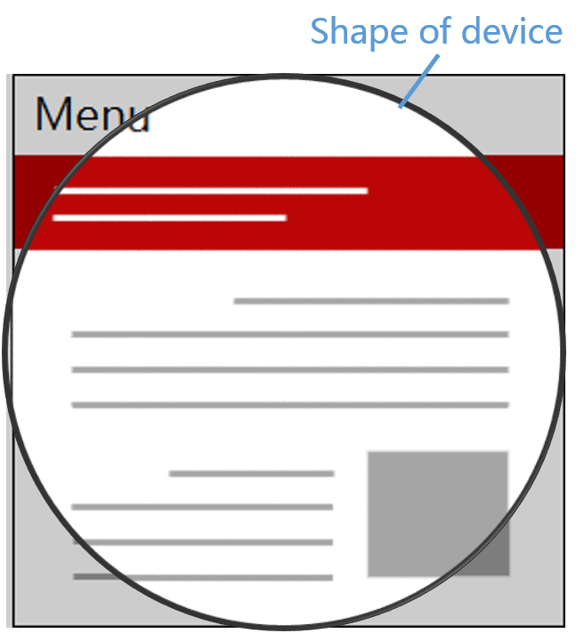 |
 |
当我们需要设置导航栏的样式或者需要处理底部样式时,需要将viewport-fit 设置为cover, 其他情况一般使用默认值即可。
env / constant
iOS11 新增特性,Webkit的CSS函数,用于设定安全区域与边界的距离,只有viewport-fit 设置为cover时才生效,有四个预定义的变量:
- safe-area-inset-left:安全区域距离左边边界距离
- safe-area-inset-right:安全区域距离右边边界距离
- safe-area-inset-top:安全区域距离顶部边界距离
- safe-area-inset-bottom:安全区域距离底部边界距离
Designing Websites for iPhone X 介绍了 constant 和 env 的之间的关系
The env() function shipped in iOS 11 with the name constant(). Beginning with Safari Technology Preview 41 and the iOS 11.2 beta, constant() has been removed and replaced with env(). You can use the CSS fallback mechanism to support both versions, if necessary, but should prefer env() going forward.
iOS11.2 beta 移除了constant()并使用env()替代,但是还是需要注意,constant() 和 env() 只能在移动端使用,在PC端不能使用。
为了兼容以前的ios版本需要constant()和env()同时存在
为什么顺序不能变?
iOS11.2之后使用env替代了constant,网上有很多文章都在说constant和env的顺序不能变,通过在ios 11.1 和 ios 13.3 版本中的实验发现改变顺序并不会影响预定义变量的行为,这里说法存疑。
body {
    padding-top: constant(safe-area-inset-top);
    padding-top: env(safe-area-inset-top);
}
ios安全区域适配
修改meta标签
<meta name="viewport" content="width=device-width, viewport-fit=cover"/>
需要安全距离的地方增加safe-area-inset-*设置
body {
    padding-top: constant(safe-area-inset-top);
    padding-top: env(safe-area-inset-top);
}
也可以使用calc()
body {
    padding-top: calc(12px+constant(safe-area-inset-top));
    padding-top: calc(12px+env(safe-area-inset-top));
}
viewport width 设置具体值情况
为width设置一个具体的值
<meta name="viewport" content="width=750, initial-scale=1, viewport-fit=cover"/>
width=device-width 设置页面宽度为设备宽度, html 和 body 初始宽度就是设备宽度, 页面内容不会随着设备的宽度改变而发生变换,需要通过其他途径适配移动端
width=750 设置页面宽度为750,如何当前设置宽度和width设定的值不匹配的话viewport会进行等比例的缩放, 这种设置可以方便我们按照750设计稿进行开发,也不用进行百分比/rem处理,适用于内嵌的H5页面
因为是浏览器viewport进行的等比例缩放, 所以实际上影响到safe-area-inset-*的展示效果
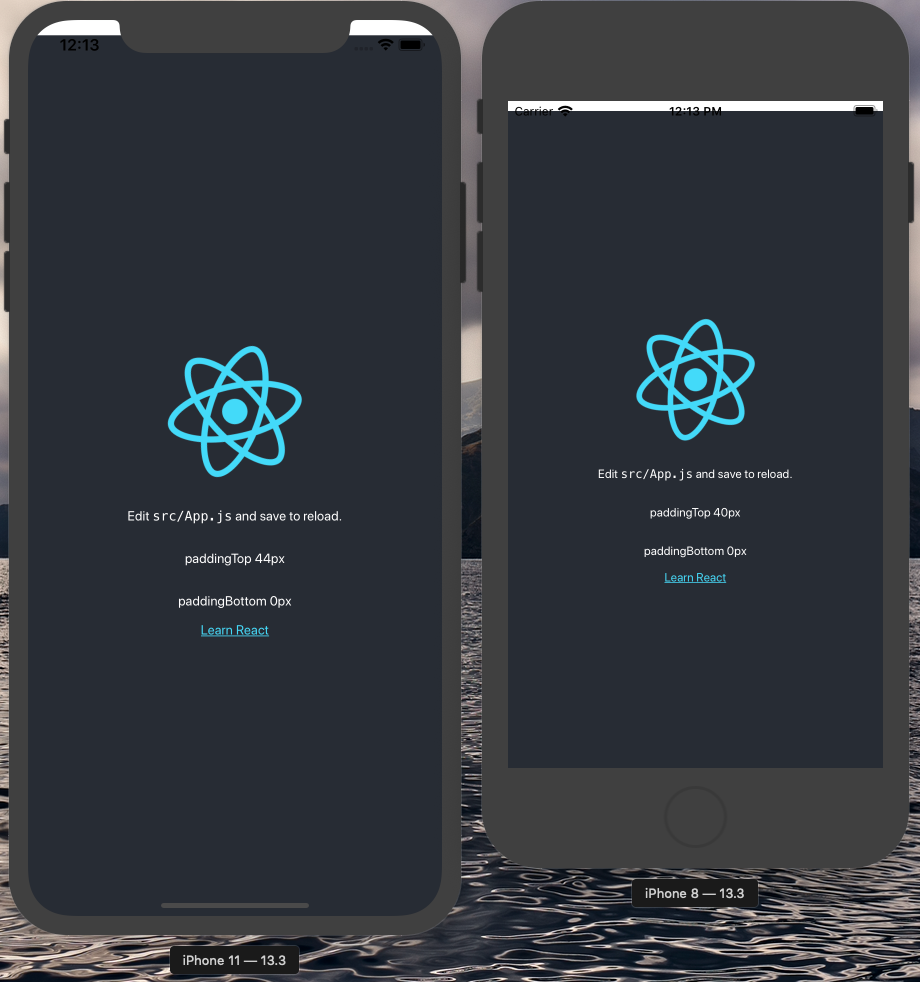
在页面的输出中可以看到 iPhoneX之前的机型顶部安全距离safe-area-inset-top是20px,iPhoneX及之后的机型的安全距离是44px,iPhoneX之前的机型底部部安全距离safe-area-inset-bottom是0,iPhoneX及之后的机型的安全距离是34px
实际效果是安全区域的高度只有数值的一半,导致安全区域没有绝对安全。我们可以通过媒体查询进行安全区域的设置。
使用媒体查询的原因主要是:
- 刘海屏手机和非刘海屏手机顶部高度不同
- safe-area-inset-(top/bottom/left/right) 不能应对缩放问题
设备宽高和设备像素比主要参考了官网的数值:Specifications iOS, iPadOS Device screen sizes and orientations
/* iPhone13/pro */
@media only screen and (device-width: 390px) and (device-height: 844px) and (-webkit-device-pixel-ratio: 3),
/* iPhone13/12 Mini | iPhone 11 Pro | iPhone XS|X */
  screen and (device-width: 375px) and (device-height: 812px) and (-webkit-device-pixel-ratio: 3),
/* iPhone13/12 Pro Max */
  screen and (device-width: 428px) and (device-height: 926px) and (-webkit-device-pixel-ratio: 3),
/* iPhone11 Pro Max */
  screen and (device-width: 414px) and (device-height: 896px) and (-webkit-device-pixel-ratio: 3),
/* iPhone11 | iPhone XR */
  screen and (device-width: 414px) and (device-height: 896px) and (-webkit-device-pixel-ratio: 2)
{
  .App {
    padding-top: 88px;
    padding-bottom: 64px;
  }
}

@media screen and (max-device-width: 375px) and (max-device-height: 667px) and (-webkit-device-pixel-ratio: 2),
screen and (max-device-width: 414px) and (max-device-height: 736px) and (-webkit-device-pixel-ratio: 3) {
  .App {
    text-align: center;
    padding-top: 40px;
  }
}
上面介绍的width=device-width和width=750两种情况覆盖的场景应该可以满足平时开发的绝大部分需求。还有一些其他的情况例如:Android 也有机型会使用viewport,但是目前我还没有遇到过,后面遇到会继续补充到博客上。
总结
- 如何在本地进行ios安全区域调试
- 这里还有一个点就是如何调试老版本的ios系统如11.1(本篇没有讲述)
- viewport 相关知识点
- 实验中发现
constant和env顺序更换并不会影响到展示效果
- 实验中发现
- 如何进行ios安全区域适配,分两种情况:
- width=device-width
- specifical width
safearea ios